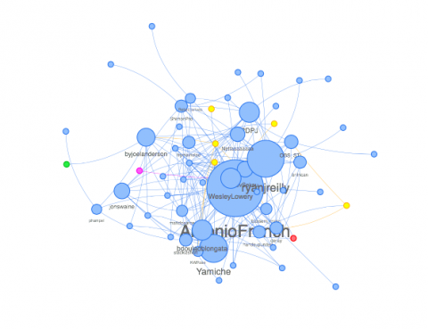
My logic for Method 4 stemmed from my research in comparing tweets that contain only text and those that also contain images. Therefore, for this assignment I compared the map of influencers who tweeted using only text versus the map of influencers who also used images in their tweets. I was interested in examining the first two months after Michael Brown was shot (August 7, 2014-October 7, 2014), and then created the two maps.
The text-only influencers map is almost perfectly symmetrical, with Antonio French being the center of the map. Antonio French also has the largest circle within the map, and this circle is about quadruple the size of the next biggest circle (belonging to Ryan J. Reilly). There are many smaller influencers who are stemming from French, Reilly, and influencers alike. There is a cluster of bigger circles overlapping each other, while the smaller circles stem off in a symmetrical, circular manner. The image-using influencers map is not symmetrical. Most of the bigger influencers are focused to the right, with smaller influencers mostly stemming out to the left. Antonio French is still the biggest influencer, but Ryan J. Reilly has a much bigger circle in this map compared to his appearance in the text-only map.
The bigger the circle, the higher the metric, and the greater the influence that tweeter has. Therefore, it is apparent that Antonio French was the most popular influencer within these maps during this timeframe. Also, Ryan J. Reilly was more influential when he used images than when he used text-only. In this case, influential means the tweeter reached a large audience, and received a lot of response via replies, retweets, and likes. The smaller circles represent tweeters who did not have as much of an influence during the time, but it's easy to see that even the small circles connect with the large circles, meaning their messages still relate. One aspect of the maps that I thought was interesting was that they were predominately comprised of male tweeters. These network maps show that either males were more likely to tweet on this topic during this time, they were more influential than women during this time, or both.
These maps relate to the snowball effect, because many of these activists/influencers became popular because of their tweets. Their tweets were being retweeted by one person, who would then also retweet it, who would then lead someone else to retweet it, and the cycle continued. This gained them more followers, and more publicity in the Twitter world.
- Log in to post comments

